Introduction to Validation Controls
Data entered by the user is assumed to be correct and appropriate. But it is impossible and user must validate the data before it is processed. The validation can be applied to the code using various scripting languages. It is necessary that the user is capable of using scripting languages. To overcome this the validation controls are provided by ASP.NET. Each control has its unique functionality to be performed. The detail description and working of these controls is explained in this chapter.
A validation control is used to validate data from the input control. The error message will be displayed if the data is incorrect. The syntax for creating validation control in ASP.NET control is as shown below:
9.1 Required Field Validator
Required Field Validator control is used to make the input field a required field in the application. The control raises an error if the input value is not entered by the user. By default, the initial value is an empty string.
The properties associated with the control are as follows:
Property | Description |
id | It is the unique id for the control |
runat | It specifies that the control is a server control |
Text | It is the message to be displayed when the validation fails |
IsValid | It is a Boolean value indicating that ControlToValidate is valid |
InitialValue | It is the starting value of the control |
Forecolor | It is the foreground color of the control |
ErrorMessgae | It is the text displayed when the property is not set for the control |
Display | It is the display behavior of the control. The values are as follows: None: The control is not displayed Static: The control displays an error message when the validation fails Dynamic: The control displays an error message if the validation fails |
BackColor | It is the back color for the control |
ControlToValidate | It is the id for the control |
EnabledClientScript | It is a Boolean value specifying the client side validation is enabled |
Enabled | It is a Boolean value that specifies the client side validation is enabled or not |
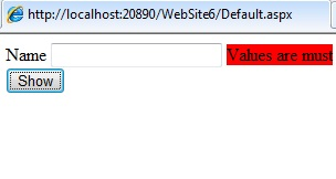
<html xmlns=”http://www.w3.org/1999/xhtml">
 <head runat=”server”>
    <title></title>
 </head>
 <body>
   <form id=”form1” runat=”server”>
     <div>
    <asp:Label ID=”Label1” runat=”server” Text=”Name” ></asp:Label>
    <asp:TextBox ID=”TextBox1” runat=”server”></asp:TextBox>
    <asp:RequiredFieldValidator ID=”RequiredFieldValidator1” runat=”server” ControlToValidate=”TextBox1” ErrorMessage=”Values are must” BackColor=”Red”>
    </asp:RequiredFieldValidator>
    <br/>
    <asp:Button ID=”Button1” runat=”server” Text=”Show” />
      </div>
   </form>
 </body>
</html>
Output is:
9.2 Range Validator
The Range Validator control is used to check that the user enters an input between two values. User can check between numbers, dates and characters. The control will not fail if the input value is not converted to the specific type.
The properties of the Range Validator are as follows:
Property | Description |
Text | It is the message to be displayed when the validation fails |
runat | It specifies that the control is a server control |
MaximumValue | It specifies the maximum value of the control |
MinimumValue | It specifies the minimum value of the control |
IsValid | It is a Boolean value that indicates that control specified by the ControlToValidate is valid |
ControlToValidate | It is the id of the control to be validated |
BackColor | It is the background color of the control |
id | It is the unique id for the control |
A sample code for the range validator control is:
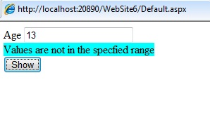
<html xmlns=”http://www.w3.org/1999/xhtml” >
 <head runat=”server”>
   <title></title>
 </head>
 <body>
   <form id=”form1” runat=”server”>
     <div>
        <asp:Label ID=”Label1” runat=”server” Text=”Age” ></asp:Label>
    <asp:TextBox ID=”TextBox1” runat=”server”></asp:TextBox><br/>
    <asp:RangeValidator ID=”RangeValidator1” runat=”server” ErrorMessgae=”Values are not in the specified range” ControlToValidate=”Textbox1” Type=”Integer” MinimumValue=”18” MaximumValue=”25” BackColor=”Aqua” >
    </asp:RangeValidator>
    <br/>
    <asp:Button ID=”Button1” runat=”server” Text=”Show” />
     </div>
   </form>
 </body>
</html>
Output is:
9.3 Compare Validator
The Compare Validator is used to compare the values of one input control to the another input control or to a fixed value. If the input control value is empty then no validation occurs. The properties of the control are as follows:
Property | Description |
id | It is the unique id for the control |
runat | It specifies that the control is a server control |
Text | The message to be displayed when the validation fails |
Operator | It is the type of comparison to be performed. The operators used are Equal, GreaterThan, LessThan, LessThanEqual, NotEqual, DataTypeCheck, GreaterThanEqual |
ControlToCompare | The name of the control to be compared with |
BackColor | It is the background color of the control |
ControlToValidate | The id of the control to be validated |
EnableClientScript | It is a Boolean value to specify the client side validation |
Type | It specifies the data type of the values to compare. The types are currency, Date, Double, Integer, String |
Display | It is the display behavior of the control. The values are as follows: None: The control is not displayed Static: The control displays an error message when the validation fails Dynamic: The control displays an error message if the validation fails |
A sample code for the control is as shown below:
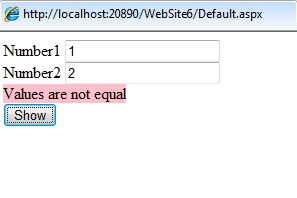
<html xmlns=”http://www.w3.org/1999/xhtml”>
 <head runat=”server”>
    <title></title>
 </head>
 <body>
   <form id=”form1” runat=”server”>
     <div>
       <asp:Label ID=”Label1” runat=”server” Text=”Number1” ></asp:Label>
       <asp:TextBox ID=”TextBox1” runat=”server”></asp:TextBox><br/>
       <asp:Label ID=”Label2” runat=”server” Text=”Number2” ></asp:Label>
       <asp:TextBox ID=”TextBox2” runat=”server”></asp:TextBox><br/>
       <asp:CompareValidator ID=”CompareValidator1” runat=”server” ErrorMessage=”Values
are not equal“ ControlToCompare=”TextBox2” ControlToValidate=”TextBox1” Type=”Integer” Operator=”Equal” BackColor=”Pink” >
       </asp:CompareValidator>
       <br/>
       <asp:Button ID=”Button1” runat=”server” Text=”Show” />
     </div>
   </form>
 </body>
</html>
Output is:
9.4 Regular Expression
The Regular Expression validator control is used to ensure that an input value matches a specifies pattern. It is useful for checking email address, phone numbers, zip codes, etc. The validation will not fail is the input control is empty. The properties of the control are as mentioned below:
Property | Description |
id | It is the unique id for the control |
runat | It specifies that the control is a server control |
ValidationExpression | It specifies that the expression used to validate the input control |
ControlToValidate | It is the id of the control to validate |
EnableClientScript | It is a Boolean value specifying the client side validation is enabled |
ForeColor | It is the foreground color of the control |
BackColor | It is the background color of the control |
ErrorMessage | It is the text to display the ValidationSummary control when the validation fails |
IsValid | It is a Boolean value that indicates that control specified by the ControlToValidate is valid |
A sample code of the control is as shown below:
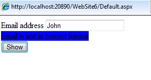
<html xmlns=”http://www.w3.org/1999/xhtml”>
 <head runat=”server”>
     <title></title>
 </head>
 <body>
    <form id=”form1” runat=”server” >
     <div>
      <asp:Label ID=”Label1” runat=”server” Text=”Email address”></asp:Label>
      <asp:TextBox ID=”TextBox1” runat=”server”></asp:TextBox>
      <asp:RegularExpressionValidator ID=”RegularExpressionValidator1” runat=”server”
      ControlToValidate=”TextBox1” ErrorMessage=”Email is not in correct format” BackColor=”Blue” ValidationExpression=”\w+([-+.’]\w+)*@\w+([-.])\w+([-.]\w+)*” >
      </asp:RegularExpressionValidator>
      <br/>
      <asp:Button ID=”Button1” runat=”server” Text=”Show” />
     </div>
    </form>
 </body>
</html>
Output is:
9.5 Custom Validator
The custom validator allows the user to write a method to handle the validation of the value entered. It is used to compare the users input to a value in the database or the arithmetic validations for the controls. The properties for the control are as mentioned below:
Property | Description |
ClientValidationFunction | It specifies the name of the client side validation script function to be executed |
ControlToValidate | It is the id of the control to validate |
Display | It is the display behavior of the control. The values are as follows: None: The control is not displayed Static: The control displays an error message when the validation fails Dynamic: The control displays an error message if the validation fails |
id | It is the unique id for the control |
runat | It specifies that the control is a server control |
EnableClientScript | It is a Boolean value specifying the client side validation is enabled |
ForeColor | It is the foreground color of the control |
BackColor | It is the background color of the control |
OnServerValidate | It specifies the name of the server side validation script function to be executed |
ErrorMessage | It is the text to display the ValidationSummary control when the validation fails |
A sample code of the control is as shown below:
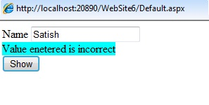
<html xmlns=”http://www.w3.org/1999/xhtml”>
 <head runat=”server”>
    <title></title>
 </head>
   <form id=”form1” runat=”server”>
      <div>
    <asp:Label ID=”Label1” runat=”server” Text=”Name” ></asp”Label>
    <asp:TextBox ID=”TextBox1” runat=”server”></asp:TextBox><br/>
    <asp:CustomValidator ID=”CustomValidator1” runat=”server” ErrorMessage=”Value entered is incorrect” ControlToValidate=”TextBox1” BackColor=”Aqua” OnServerValidate=”CustomValidate_value” >
    </asp:CustomValidator>
    <asp:Button ID=”btn1” runat=”server” Text=”Show” />
      </div>
   </form>
</html>
Output is:
9.6 Validation Summary
The Validation Summary control is used to display the summary of all validation errors in a web page. The error message displayed in this control is specified by the Error Message property for every validation control. The summary can be displayed as a list, bulleted list, single paragraph depending on the DisplayMode property. The properties for the control are as follows:
Property | Description |
DisplayMode | It defines how the summary will be displayed. The values are: BulletList, List, paragraph |
id | It is the unique id for the control |
runat | It specifies that the control is a server control |
EnableClientScript | It is a Boolean value specifying the client side validation is enabled |
ForeColor | It is the foreground color of the control |
ShowSummary | It is a Boolean value that specifies whether ValidationSummary control should be displayed |
HeaderText | It is a header in the ValidationSummary Control |
ShowMessageBox | It is a Boolean value that specifies the summary should be displayed in the MessageBox or not |
Enabled | It is a Boolean value that specifies whether the validation control is enabled or not |
A code sample for the control is as shown below:
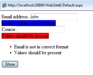
<html xmlns=”http://www.w3.org/1999/xhtml”>
 <head runat=”server”>
    <title></title>
 </head>
 <body>
   <form id=”form1” runat=”server”>
     <div>
    <asp:Label ID=”Label1” runat=”server” Text=”Email address”></asp:Label>
    <asp:TextBox ID=”TextBox1” runat=”server”></asp:TextBox>
    <asp:RegularExpressionValidator ID=”RegularExpressionValidator1” runat=”server” ControlToValidate=”TextBox1” ErrorMessage=”Email is not in correct format” BackColor=”Blue” ValidationExpression=”\w+([-+.’]\w+)*\.\w+([ -. ] \w+)*” >
    </asp:RegularExpressionValidator>
    <br/>
    <asp:Label ID=”Label2” runat=”server” Text=”Course” ></asp:Label>
    <asp:TextBox ID=”TextBox2” runat=”server” ></asp:TextBox>
    <br/>
    <asp:RequiredFieldValidator ID=”RequiredFieldValidator1” runat=”server” ControlToValidate=”TextBox2” BackColor=”Red” ErrorMessage=”Values should be present” >
    </asp:RequiredFieldValidator>
    <br/>
    <asp:ValidationSummary ID=”ValidationSummary1” runat=”server” />
    <asp:Button ID=”Button1” runat=”server” Text=”Show” />
     </div>
   </form>
 </body>
</html>
Output is: