17.1 AdRotator Control
The AdRotator control is used to display a sequence of advertisement images. It uses an external XML file to store the ad information. The XML file consists of several tags for designing the content in an application. The XML file consists of <Advertisements> tag at the start and end of the tags added. There are several <Ad> tags defined inside the <Advertisements> tag.
The list of elements that can be added in the <Ad> tag are as mentioned below:
Element | Description |
<ImageUrl> | It defines the path of the image file |
<NavigateUrl> | It is the URL to be linked when the user clicks the ad |
<AlternateText> | It is an alternate text for the image |
<Keyword> | It is a category for the ad |
<Impressions> | It is the display rate for the number of hits on an ad |
<Height> | It is used to define the height of the image |
<Width> | It is used to define the width of the image |
Some of the properties of the AdRotator control are mentioned below:
Property | Description |
AdvertisementFile | It gets or sets the path to an XML file containing the advertisement information |
Attributes | It gets the collection of arbitrary attributes that do not correspond to the control |
BackColor | It gets or sets the background color of the Web Server control |
BorderColor | It gets or sets the border color of the Web Server control |
ClientID | It gets the controlID for the HTML Markup generated by ASP.NET |
Context | It gets the HttpContext object associated with the server control |
CssClass | It gets or sets the CSS class rendered by the Web Server control |
DataSource | It gets or sets the object from which the data bound control retrieves the list of data items |
Enabled | It gets or sets the value indicating the Web Server control is enabled |
HasAttributes | It gets a value indicating the control has attributes set |
ImageUrlField | It gets or sets the custom data field to use instead of the ImageUrl attribute |
ItemType | It gets or sets the name of the data type for data binding |
NavigateUrlField | It gets or sets the custom data field to use instead of the NavigateUrl attribute |
Page | It gets a reference to the Page instance containing the server control |
RenderingCompatibility | It gets a value specifying the version of ASP.NET for rendering |
SelectMethod | It is the name of the method to call in order to read data |
TabIndex | It gets or sets the tab index of the Web Server control |
Target | It gets or sets the name of the browser window or frame |
ToolTip | It gets or sets the text to be displayed when the mouse pointer hovers over the control |
Visible | It gets or sets the value indicating the server control is rendered as UI on the page |
The list of some AdRotator events is mentioned below:
Events | Description |
AdCreated | It occurs once during the round trip to the server after the creation of the control |
CallingDataMethods | It occurs when data methods are being called by the user |
CreatingModelDataSource | It occurs when the ModelDataSource object is being created |
DataBinding | It occurs when the server control binds to a data source |
DataBound | It occurs after the server control binds to a data source |
Disposed | It occurs when the server control is released from memory |
Init | It occurs when the server control is initialized |
Load | It occurs when the server control is loaded into Page object |
PreRender | It occurs when the control object is loaded prior to rendering |
Unload | It occurs when the server control is unloaded from the memory |
An example to demonstrate the AdRotator control is as shown below:
The XML file for the AdRotator control is as mentioned below:
<Advertisments>
  <Ad>
    <ImageUrl>Tulips.jpg</ImageUrl>
    <NavigateUrl>http://www.gmail.com</NavigateUrl>
    <AlternateText>Gmail</AlternateText>
    <Keyword>Site</Keyword>
  </Ad>

  <Ad>
    <ImageUrl>LightHouse.jpg</ImageUrl>
    <NavigateUrl>http://www.google.com</NavigateUrl>
    <AlternateText>Google</AlternateText>
    <Keyword>Site</Keyword>
  </Ad>
</Advertisments>
The source code file for AdRotator file is as shown below:
<form id=”form1” runat=”server”>
 <div>
    <asp:AdRotator ID=”AdRotator1” runat=”server” AdvertismentFile=”~/XMLFile.xml” />
 </div>
</form>
The output is as shown below:


17.2 Calendar control
Calendar control is used to display a calendar in the browser. It displays a one month calendar allowing user to select dates and move to the different months. Some of the properties of the calendar control are as mentioned below:
Property | Description |
AccessKey | It gets or sets the access key allowing to navigate to the Web Server control |
Attributes | It gets the collection of arbitrary attributes not corresponding to control properties |
BindingContainer | It gets the control that contains the controls data binding |
BorderWidth | It gets or sets the border width of the Web Server control |
Caption | It gets or sets the text value rendered as caption for the calendar |
CellPadding | It gets or sets the space between the cell contents and cell border |
CellSpacing | It gets or sets the space between cells |
ClientID | It gets the ControlID for HTML markup generated by the ASP.NET |
Context | It gets the HttpContext object associated with the server control |
DataItemContainer | It gets a reference to the naming container if the container implements IDataItemContainer |
Enabled | It gets or sets the value indicating the control is enabled |
Font | It gets the font properties associated with the Web Server control |
HasAttributes | It gets a value indicating the control has attributes set |
Height | It gets or sets the height of the control |
ID | It gets or sets the identifier assigned to the control |
NamingContainer | It gets a reference to the server controls naming container |
NextMonthText | It gets or sets the text displayed for next month navigation control |
Page | It gets the reference to the Page instance of the server control |
PrevMonthText | It gets or sets the text displayed for the previous month navigation control |
SelectedDate | It gets or sets the selected date |
SelectionMode | It gets or sets the date selection mode on the control |
SelectMonthText | It gets or sets the text displayed for the month selection element |
TabIndex | It gets or sets the tab index of the Web Server control |
TemplateControl | It gets or sets the reference to the template that contains the control |
TodaysDate | It gets or sets the value for today date |
WeekendDayStyle | It gets or sets the style properties for the weekend date on the control |
Some of the events related to the calendar control are as mentioned below:
Events | Description |
DataBinding | It occurs when the server control binds to a data source |
DayRender | It occurs when the day is created in the control hierarchy |
Disposed | It occurs when the server control is released in the memory |
Init | It occurs when the server control is initialized |
Load | It occurs when the server control is loaded in the Page object |
PreRender | It occurs after the control object is loaded but before rendering of the control |
SelectionChanged | It occurs when the user selects a day, a week, or month by clicking the selector control |
Unload | It occurs when the server control is unloaded from the memory |
VisibleMonthChanged | It occurs when the user clicks the next and previous month navigation controls on the title heading |
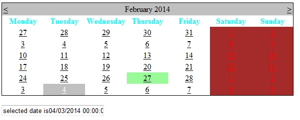
The sample code for calendar control is as shown below:
<html xmlns=”http://www.w3.org/1999/xhtml”>
<head runat=”server”>
    <title></title>
</head>
 <body>
    <form is=”form1” runat=”server”>
      <div>
         <asp:Calender ID=”Calendar1” runat=”server” DayNameFormat=”Full” BorderColor=”Black” onselectionchanged=”Calendar1_SelectionChanged”>
         <WeekendDayStyle BackColor=”Brown” ForeColor=”Red” />
         <DayHeaderStyle ForeColor=”Aqua”/>
         <TodayDayStyle BackColor=”PaleGreen” />
         </asp:Calendar><br/>
         <asp:TextBox ID=”TextBox1” runat=”server” Width=”200px”></asp:TextBox>
      </div>
    </form>
 </body>
</html>
The code behind file is as shown below:
public partial class Default2: System.Web.UI.Page
{
   protected void Page_Load( object sender, EventArgs e)
   {
     Calendar1.SelectedDate = DateTime.Now;
   }
   protected void Calendar1_SelectionChanged(object sender, EventArgs e)
   {
     TextBox1.Text=”selected date is”+Calendar1.SelectedDate;
   }
}
The output is:
17.3 MultiView Control
MultiView control is used to declare multi views and view only single view at one time. The View displayed to the user is an active view. The syntax of MultiView control is:
<asp:MultiView ID=”MultiView1” runat=”server”></asp:MultiView>
The syntax of view control is as shown below:
<asp:View ID=”View1” runat=”server”></asp:View>
Some of the properties of the MultiView control are as shown below:
Property | Description |
ActiveViewIndex | It gets or sets the index of the active view control within the MultiView control |
Adapter | It gets the browser specific adapter for the control |
BindingContainer | It gets the control that contains the controls data binding |
ClientID | It gets the controlID for the HTML markup generated by ASP.NET |
Context | It gets the HttpContext object associated with the server control |
DataItemContainer | It gets a reference to the naming container implemented by IDataItemContainer |
EnableTheming | It gets or sets a value indicating the themes apply to the control |
HasChildViewState | It gets the value indicating whether the servers child control has view state settings |
Page | It gets a reference to the Page instance that contains the server control |
Site | It gets the information about the container that hosts the control |
TemplateControl | It gets or sets a reference to the template that contains the control |
Views | It gets the collection of View controls in the control |
Visible | It gets or sets a value that indicates whether a server control is rendered as UI on the page |
ViewStateMode | It gets or sets the view state of this control |
Some of the events for the MultiView control are as shown below:
Events | Description |
ActiveViewChanged | It occurs when the active view control of a MultiView control |
DataBinding | It occurs when the server control binds to a data source |
Disposed | It occurs when the server control is released from memory |
Init | It occurs when the server control is initialized |
Load | It occurs when the server control is loaded into the Page object |
PreRender | It occurs after the Control object is loaded before rendering of the control |
Unload | It occurs when the server control is unloaded from the memory |
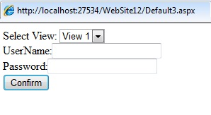
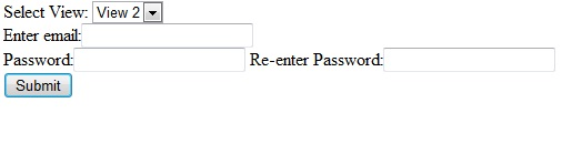
A sample code for the MultiView control is as shown below:
<body>
  <form id=”form1” runat=”server”>
   <div>
     Select View:
    <asp:DropDownList ID=”DropDownList1” AutoPostBack=”true” runat=”server” onselectedindexchanged=”DropDownList1_SelectedIndexChanged”>
      <asp:ListItem Value=”0”>View1</asp:ListItem>
      <asp:ListItem Value=”1”>View2</asp:ListItem>
    </asp:DropDownList>
    <br/>

    <asp:MultiView ID=”MultiView1” runat=”server” ActiveViewIndex=”0” >
      <asp:View ID=”View1” runat=”server”>
        UserName: <asp:TextBox ID=”TextBox1” runat=”server”></asp:TextBox><br/>
        Password:<asp:TextBox ID=”TextBox2” runat=”server”></asp:TextBox><br/>
        <asp:Button ID=”btn1” runat=”server” Text=”confirm”/>
      </asp:View>

      <asp:View ID=”View2” runat=”server”>
        Enter Email: <asp:TextBox ID=”TextBox3” runat=”server”></asp:TextBox><br/>
        Password:<asp:TextBox ID=”TextBox4” runat=”server”></asp:TextBox><br/>
        RE-enter Password:<asp:”TextBox5” runat=”server”></asp:TextBox>
        <asp:Button ID=”btn2” runat=”server” Text=”Submit”/>
      </asp:View>
    </asp:MultiView>
   </div>
  </form>
</body>
The code behind file is as shown below:
protected void DropDownList1_SelectedIndexChanged( object sender, EventArgs e)
{
   MultiView1.ActiveViewIndex = 1;
}
The output is as shown below:
17.4 Panel control
The Panel control is used as a container for other controls. It is used for designing other controls appearance contained in it. The control is derived from WebControl class.
Some of the properties for the Panel control are mentioned below:
Property | Description |
BackImageUrl | It gets or sets the URL of the background image for the control |
DefaultButton | It gets or sets the identifier for the default button contained for the control |
Direction | It gets or sets the direction in which the controls that include text are displayed |
GroupingText | It gets or sets the caption for the group of controls contained in the control |
HorizontalAlign | It gets or sets the horizontal alignment of the contents within the panel |
ScrollBars | It gets or sets the visibility and position of scroll bars in the control |
SupportsDisabledAttribute | It gets a value that indicates the control should set the disabled attribute |
Wrap | It gets or sets a value indicating whether the content wraps within the control |
The sample code for the Panel control is as shown below:
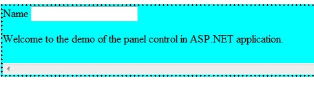
<html xmlns=”http://www.w3.org/1999/xhtml”>
 <head runat=”server”>
    <title></title>
 </head>
 <body>
   <form id=”form1” runat=”server”>
     <div>
    <asp:Panel ID=”Panel1” runat=”server” BorderColor=”Black” BorderStyle=”Dotted” Height=”100px” ScrollBars=”Horizontal” BackColor=”Aqua”>
     <asp:Label ID=”Label1” runat=”server” Text=”Name”></asp:Label>
     <asp:TextBox ID=”txt1” runat=”server”></asp:TextBox>
     <br/>
     <p>Welcome to the demo of the panel control in ASP.NET application.
     </p>
    </asp:Panel>
     </div>
   </form>
 <body>
</html>
The output is as shown below: