ASP.NET server controls are created on the server and they have runat=”server” attribute. They do not always map Html elements but can be used to represent the complex elements. The syntax of creating a web server control is:
<asp:control_name is=”some_id” runat=”server” />
The controls can be added easily by dragging and dropping controls in the design view. The intellisense feature helps to display and complete the properties of the specific controls. The Properties window is used to set the property values directly to the control.
8.1 Properties of ASP.NET Server Controls
The properties are used instead of public fields. All properties have ancestor methods. All the properties are inherited from the System.Web.UI.Control class. The list of ASP.NET server control properties are as mentioned below:
Property | Description |
Attributes | It contains collection of the arbitrary attributes. |
AccessKey | The combination with alt key moves the focus of the control |
BackColor | It is the background color of the control |
BorderColor | It is the border color of the control |
BindngContainer | It the control containing the specific data binding value |
BorderStyle | It is the style of border for the control |
BorderWidth | It is the width of the border for the control |
CssClass | It is the cascading style sheet class for the control |
ControlStyle | It is the style of the web control |
Controls | It is the collection of controls within the control |
Context | It is the HttpContext object associated with the control |
ClientID | It is the control ID for the HTML markup |
ChildControlCreated | It shows if the child control for the server control is created |
CausesValidation | It indicates if the validation is caused |
DisabledCssClass | It gets or sets the CSS class for the Html element when the control is disabled |
DataItemContainer | It returns the reference of the naming container and implements IDataItemContainer |
DataKeysContainer | It returns the reference of the naming container and implements IDataKeysControl |
DesignMode | It represents the design surface of the control used |
Enabled | It indicates gray color if the control is active |
Events | It provides a list of event handlers for the control |
EnableTheming | It indicates whether the theming is applied to the control |
EnabledViewState | It indicates if the view state of the control is maintained |
Font | It represents the font of the control |
ForeColor | It is the foreground color of the control |
HasChildViewState | It is used to check whether the view state settings for the child control are saved |
Height | It sets the height of the control in pixels or percentage |
HasAttributes | It checks for the attributes of the control |
ID | It is the identifier for the control |
IsEnabled | It gets a value indicating the control is enabled |
IsTrackingViewState | It is used for checking whether the server control is saving changes in the view state |
IsViewStateEnabled | It is used for checking whether the server control has enabled the view state |
LoadViewStateByID | It represents that control is loading its view state by ID instead of the index |
Page | It is the page containing the control |
Parent | It is the parent control |
RenderingCompatibility | It is used to specify that the ASP.NET version rendering the Html is compatible with it |
Site | It is the container that holds the current control when rendered on the surface |
SkinID | It is used to get or set the skin to apply to the control |
Style | It gets the collection of text attributes that are rendered as style attribute |
TabIndex | It gets or sets the tab index for the specific control |
TabKey | It gets the HtmlTextWriterTag value for the corresponding web control |
TagName | It gets the name of the control tag |
TemplateControl | It is the template that contains this control |
ToolTip | It set the text when the mouse pointer moves over the control |
ViewState | It saves the view state of the control |
ViewStateMode | It gets or sets the view state mode of the control |
Visible | It indicates the server control visibility |
Width | It sets the width of the control |
8.2 Methods of the ASP.NET Server Controls
The methods of the server controls are as mentioned below:
Method | Description |
AddedControl | It is called after the child control is added to the controls collection |
AddAttributesToRender | It adds Html attributes and styles to be rendered to the specific HtmlTextWriterTag |
ApplyStyleSheetSkin | It applies the style properties in the page style sheet of the control |
AddParsedSubObject | It checks whether XML or HTML element was parsed |
ClearCachedClientID | It sets the cached client ID value to null |
ClearChildState | It deletes the view state and control state information |
ClearChildControlState | It deletes the control state information for the child controls |
ClearChildViewState | It deleted the view state of the control and its child controls |
CreateChildControls | It is used to create child controls |
CreateControlCollection | It creates a control collection object that holds the child controls |
CreateControlStyle | It creates a style object for implementing the style related properties |
DataBind | It bind the data to the source of the server control |
Dispose | It enabled the server control to perform the memory clean up |
EnsureChildControls | It checks whether the server control contains the child controls |
EnsureID | It creates a unique identifier for the controls |
Equals(Object) | It checks that the specified object is equal to the current object |
Finalize | It performs cleanup operation before garbage collection |
FindControl(string) | It searches the current naming container for a server control |
Focus | It sets input focus to the control |
GetType | It gets the type of the current instance |
GetUniqueIDRelativeTo | It returns the prefixed portion of the UniqueID property of the specific control |
HasControls | It is used to determine that the server control has any chils controls |
HasEvents | It states whether events are registered for control or its child controls |
LoadControlState | It restores the control state information |
LoadViewState | It restores the view state information |
MapPathSecure | It retrieves the physical path of the control |
MergeStyle | It copies any nonblank elements of the specified style |
OnBubbleEvent | It checks that the event for the server control is passed |
OnDataBinding | It raises the data binding event |
OnInit | It raises the Init event |
OnLoad | It raises the Load event |
OnPreRender | It raises the PreRender event |
OnUnload | It raises the UnLoad event |
OpenFile | It get a stream to read files |
RemovedControl | It is called after the child control is removed from the collection |
Render | It renders the Html opening tag of the control |
RenderContents | It renders the contents of the control |
RenderEndTag | It renders the Html closing tag of the control |
SaveControlState | It saves the server control state |
SetDesignModeState | It saves any state that was modified after the TrackViewState method |
ToString | It returns the string that represents the current object |
TrackViewState | It causes the control to track changes to its view state |
8.3 Example of ASP.NET Server Controls
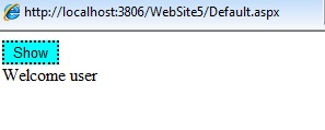
1) Button Web Server Control:
The Button control allows you to create the push button on the web page. The <asp:Button> tag is used for creating button in ASP.NET. An example of the Button control is shown below:
<html xmlns=”http://www.w3.org/1999/xhtml”>
 <head runat=”server”>
    <title></title>
 </head>
 <body>
   <form id=”form1” runat=”server”>
     <div>
    <asp:Button ID=”Button1” runat=”server” Text=”Show” onclick=”Button1_Click” BackColor=”Aqua” BorderColor=”Black” BorderStyle=”Dotted” /><br/>
    <asp:Label ID=”lbl1” runat=”server”></asp:Label>
     </div>
   </form>
 </body>
</html>
The output is:
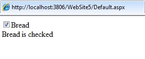
2) Checkbox Web Server Control:
The Checkbox control creates a check box on the web page and allows user to switch between true or false. The <asp:CheckBox> tag is used to create the control in ASP.NET. An example of the control is shown below:
<html xmlns=”http://www.w3.org/1999/xhtml”>
 <head runat=”server” >
    <title></title>
 </head>
 <body>
    <form id=”form1” runat=”server”>
      <div>
    <asp:CheckBox ID=”CheckBox1” runat=”server” Text=”Bread” AutoPostBack= “true” oncheckedchanged=”CheckBox1_CheckedChanged”  /><br/>
    <asp:Label ID=”label1” runat=”server”></asp:Label>
      </div>
    </form>
 </body>
</html>
protected void CheckBox1_CheckedChanged( object sender, EventArgs e)
{
  if ( CheckBox1.Checked)
  {
    label1.Text=”Bread is checked”;
  }
}
Output is:
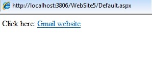
3) Hyperlink Web Server Control:
It creates link through which user can navigate between pages in an application. The <asp:HyperLink> tag is used to create hyperlink in the application. An example of the control is shown below:
<html xmlns=”http:www.w3.org/1999/xhtml” >
 <head runat=”server”>
    <title></title>
 </head>
 <body>
   <form id=”form1” runat=”server”>
    <div>
       Click here: <asp:HyperLink ID=”hyp1” runat=”server” Target=”_blank” NavigateUrl= “http://www.gmail.com” Text=”Gmail website” >
       </asp:HyperLink>
    </div>
   </form>
 </body>
</html>
Output is:
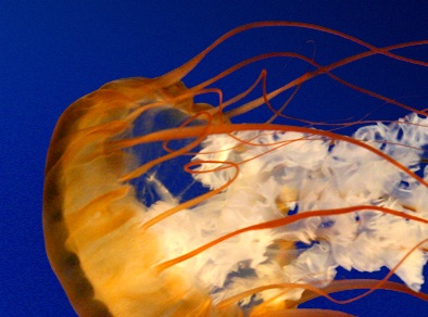
4) Image Web Server Control:
It is used to display images on the web page. The <asp:Image> tag is used to display images in the application. An example of the control is as shown below:
<form id=”form1” runat=”server”>
  <div>
     <asp:Image ID=”Image1” runat=”server” ImageUrl=”~/Image/Jellyfish.jpg” ImageAlign= “Left” />
  </div>
</form>
Output is:
5) ImageButton Web Server Control:
It is used to display image that responds to the mouse clicks. The <asp:ImageButton> tag is used for creating the control. An example of the control is as shown below:
<form id=”form1” runat=”server”>
  <div>
    <asp:ImageButton ID=”ImageButton1” runat=”server” ImageAlign=”Left” ImageUrl==”~/Image/Jellyfish.jpg” Height=”43px” onclick =”ImageButton1_Click” Width=”234px” />
    <br/>
    <asp:Label ID=”lbl1” runat=”server”></asp:Label>
  </div>
</form>
protected void ImageButton1_Click ( object sender, ImageClickEventArgs e)
{
  lbl1.Text=”The image button is clicked”;
}
Output is:

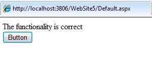
6) Label Web Server Control:
It is used to display the text in the page. The <asp:Label> tag is used to display the text. An example of the control is as shown below:
<form id=”form1” runat=”server”>
 <div>
   <asp:Label ID=”lbl1” runat=”server”></asp:Label><br/>
   <asp:Button ID=”Button1” runat=”server” Text=”Button” onclick=”Button1_Click” />
 </div>
</form>
protected void Button1_Click ( object sender, EventArgs e )
{
  lbl1.Text=”The functionality is correct”;
}
Output is:
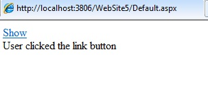
7) LinkButton Web Server Control:
It is used to button that performs the functionality of a Hyperlink control. The <asp:LinkButton> tag is used to create the hyperlink button. An example of the LinkButton is as shown below:
<form id=”form1” runat=”server”>
 <div>
   <asp:LinkButton ID=”LinkButton1” runat=”server” Text=”Show” Font-Size=”Medium” onclick=”LinkButton1_Click” ></asp:LinkButton><br/>
  <asp:Label ID=”lbl2” runat=”server”></asp:Label>
 </div>
</form>
protected void LinkButton1_Click ( object sender, EventArgs e)
{
   lbl2.Text = “User clicked the link button”;
}
Output is:
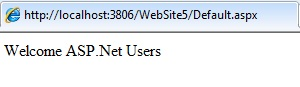
8) Literal Web Server Control:
It is used to display the static text on the web pages. The <asp:Literal> tag is used to display the text in a web page. An example of the literal control is as shown below:
<form id=”form1” runat=”server”>
 <div>
    <asp:Literal ID=”Literal1” runat=”server” Text=”Welcome ASP.NET Users”></asp:Literal>
 </div>
</form>
Output is:
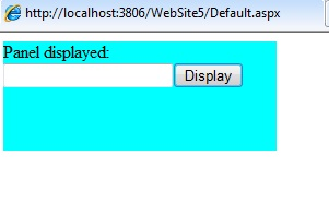
9) Panel Web Server Control:
It is used as a container for other server controls. The <asp:Panel> tag is used to display the panel control in the web page. An example of the control is as shown below:
<form id=”form1” runat=”server”>
 <div>
   <asp:Panel ID=”Panel1” runat=”server” BackColor=”Aqua” Height=”100px” Width=”250px”>Panel displayed:
   </asp:Panel>
 </div>
</form
public partial class _Default : System.Web.UI.Page
{
    protected void Page_Load( object sender, EventArgs e)
    {
        TextBox t = new TextBox();
        Button b = new Button();
        b.Text = “Display”;
        Panel1.Controls.Add(t);
        Panel1.Controls.Add(b);
        Panel1.Visible=true;
    }
}
Output is:
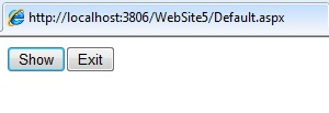
10) PlaceHolder Web Server Control:
It is used to dynamically add the controls to the web page. The <asp:PlaceHolder> tag is used to display the control on the web page. An example of the control is as shown below:
<html xmlns=”http://www.w3.org/1999/xhtml”>
 <head runat=”server”>
    <title></title>
 </head>
 <body>
  <form id=”form1” runat=”server”>
   <div>
     <asp:PlaceHolder ID=”PlaceHolder1” runat=”server”></asp:PlaceHolder>
   </div>
  </form>
 </body>
</html>
protected void Page_Load( object sender, EventArgs e)
{
  Button b1 = new Button();
  b1.Text=”Show”;
  PlaceHolder1.Controls.Add(b1);

  Button b2 = new Button();
  B2.Text=”Exit”;
  PlaceHolder1.Controls.Add(b2);
}
Output is:
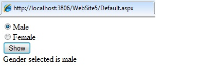
11) RadioButton Web Server Control:
It is used to create an individual radio button on the page. The <asp:RadioButton> tag is used to create the control on the page. An example of the control is as shown below:
<body>
 <form id=”form1” runat=”server”>
   <div>
     <asp:RadioButton ID=”RadioButton1” runat=”server” Text=”Male” Checked=”true” GroupName=”gen” /><br/>
    <asp:RadioButton ID=”RadioButton2” runat=”server” Text=”Female” GroupName=”gen” /><br/>
    <asp:Button ID=”Button1” runat=”server” Text=”Show” onclick=”Button1_Click” /><br/>
    <asp:Label ID=”Label1” runat=”server” Text=”Label”></asp:Label>
   </div>
 </form>
</body>
protected void Button1_Click ( object sender, EventArgs e)
{
  if ( RadioButton1.Checked)
  {
    Label1.Text=”Gender selected is male”;
  }
  else if( RadioButton2.Checked)
  {
    Label1.Text=”Gender selected is Female”;
  }
}
Output is:
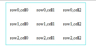
12) Table Web Server Control:
It declares a table and user can manipulate the control programmatically. The <asp:Table> tag is used to create the control on the web page. An example of the table control is as shown below:
<form id=”form1” runat=”server”>
  <div>
    <asp:Table ID=”Table1” runat=”server” HorizontalAlign=”Center” CellPadding=”15” CellSpacing=”0” BorderColor=”Aqua” BorderWidth=”1” >
    </asp:Table>
  </div>
</form>
protected void Page_Load( object sender, EventArgs e)
{
  int nrows = 3;
  int ncols = 3;
  for ( int j=0; j<nrows; j++)
  {
    TableRow r = new TableRow();
    for ( int i=0; i<ncols;i++)
    {
      TableCell c = new TableCell();
      c.controls.Add( new LiteralControl(“row” + j.ToString()+”, cell”+i.ToString()));
      r.cells.Add( c );
    }
      Table1.Rows.Add( r );
    }
}
Output is:
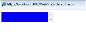
13) TextBox Web Server Control:
It is used to create a single line or multi-line text boxes. The <asp:TextBox> tag is used to add control on the web page. An example of the control is as shown below:
<form id=”form1” runat=”server”>
 <div>
  <asp:TextBox ID=”TextBox1” runat=”server” BackColor=”Blue” TextMode=”MultiLine” ontextchanged=”TextBox1_TextChanged”></asp:TextBox><br/>
 </div>
</form>
Output is: