14.1 SqlDataSource control
The SqlDataSource control is used to access data located in the relational database. It uses the ADO.NET classes to interact with any databases that are supported by ADO.NET. The providers that can be used are oracle, SQL server, ODBC and OleDb. Using the control user can access and manipulate data in the ASP.NET page.
To use the SqlDataSource control, set the ProviderName and ConnectionString property. The ProviderName is used for the type of the database used and ConnectionString for the connection to the database.
The data of the SqlDataSource control can be cached and retrieved in the application. The caching can be enabled by setting the EnableCaching property to true. The filter of the SqlDataSource control supports a FilterExpression property. User can add the selection criteria for filtering of data.
The SqlDataSource control code sample is as shown below:
<asp:SqlDataSource id=”sldatasource1” runat=”server” DataSourceMode=”DataReader” ConnectionString=”<%ConnectionStrings:EmployeeData%>”
 SelectCommand=”Select name from Employee” >
</asp:SqlDataSource>
14.2 GridView Control
The GridView control is used to provide flexibility in working and display data from the database. The data in the GridView control is displayed in the tabular format. It has several properties assigned to the control. Some of the properties are as mentioned below:
Property | Description |
AllowPaging | It is a Boolean value indicating the control supports paging |
AllowSorting | It is a Boolean value indicating the control supports sorting |
SortExpression | It accepts the current expression determining the order of the row |
Datasource | It is used to get or set the data source object containing the data to populate the control |
AutoGenerateEditButton | It is a Boolean value indicating that the user can edit the record in the control |
DataSourceID | It indicates the data source control to be used |
AutoGenerateDeleteButton | It is a Boolean value indicating that the user can delete the record in the control |
AutoGenerateColumns | It is a Boolean value to indicate the columns are automatically created for each field of the data source |
AutoGenerateSelectButton | It is a Boolean value to indicate the column should be added to select the particular record |
SortDirection | It gets the sorting direction of the column for the control |
EmptyDataText | It indicates the text to appear when there is no record in the data source |
The code sample of the GridView control is as shown below:
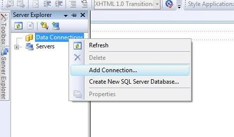
1) Add a new connection object to the ASP.NET web application as shown below:
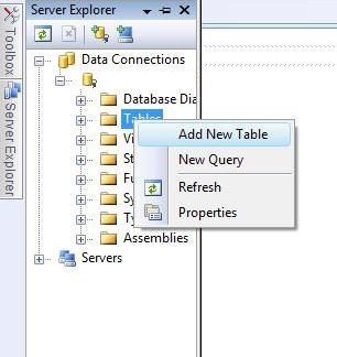
2) Next, add a new table for the connection object created above. The snippet for adding the table is as shown below:
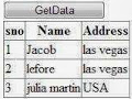
3) Add the fields Sno, Name, Address in the table. Add values to the respective fields in the table
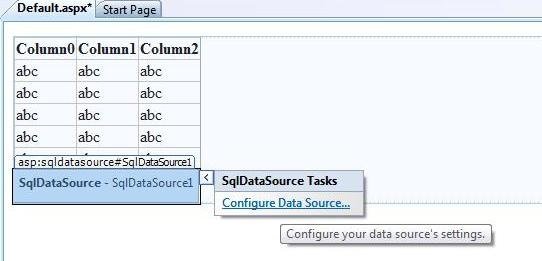
4) Add the GridView and SqlDataSource control to the design view of the web page.
5) The source code for the GridView control is as shown below:
<%@Page Language=”C#” AutoEventWireup=”true” CodeFile=”binding.aspx.cs” Inherits=”binding” %>

<!DOCTYPE html PUBLIC “-//W3C//DTD XHTML 1.0 Transitional//EN”
“http://www.w3.org/TR/xhtml1/DTD/xhtml1-transitional.dtd”>
<html xmlns=”http://www.w3.org/1999/xhtml”>
 <head runat=”server”>
     <title></title>
 </head>
 <body>
    <form id=”form1” runat=”server” >
      <asp:Button ID=”Button1” runat=”server” onclick=”Button1_Click” Text=”GetData” Width=”123px” />
      <br/>
      <div>
     <asp:GridView ID=”GridView1” runat=”server”>
     </asp:GridView>
      </div>
   </form>
 </body>
</html>
6) The code behind file contains the following code
protected void Button1_Click(object sender, EventArgs e)
{
  SqlConnection con = new SqlConnection();
  con.ConnectionString = ConfigurationManager.ConnectionStrings
  [ “ConnectionString” ].ToString();
    con.Open();

  SqlCommand cmd = new SqlCommand();
  cmd.CommandText = “Select * from deltable”;
  cmd.Connection = con;
  DataSet ds = new DataSet();
  da.Fill( ds, “deltable”);
  GridView1.DataSource= ds;
  GridView1.DataBind();
}
7) The output is:
14.3 DetailsView control
Details view control is used as a data bound control. It is used to render one record at a time. User can insert, update and delete the record from the control. Some of the properties of the DetailsView control is as shown below:
Property | Description |
AllowPaging | It is a Boolean value to indicate the control supports navigation |
DataSource | It is used to populate the control with the data source object |
DataSourceID | It indicates the bound data source control with corresponding adapters |
AutoGenerateEditButton | It is a Boolean value to indicate the column can be edited by the user |
AutoGenerateDeleteButton | It is a Boolean value to indicate the records can be deleted |
DefaultMode | It is used to indicate the default display mode of the control |
AutoGenerateRows | It is a Boolean value to indicate the rows are automatically created for each field in the data source |
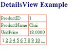
The sample code for the Details View control is as shown below:
<%@ Page Language=”C#” %>

<!DOCTYPE html PUBLIC “-//W3C//DTD XHTML 1.0 Transitional //EN”
“http://www.w3.org/TR/xhtml1/DTD/xhtml1-transitional.dtd” >

<script runat=”server”>
</script>

<html xmlns=”http://www.w3.org/1999/xhtml”>
 <head runat=”server”>
    <title>asp.net DetailsView example: how to use DetailsView</title>
 </head>
 <body>
    <form id=”form1” runat=”server” >
    <div>
    <h2 style=”color:Navy” >DetailsView Example</h2>
    <asp:SqlDataSource ID=”SqlDataSource1” runat=”server” ConnectionString=”<%$ ConnectionStrings: NorthwindConnectionString %>”
    Select Command = “SELECT ProductID, ProductName, UnitPrice FROM Products”;
    </asp:SqlDataSource>
    <asp:DetailsView ID=”DetailsView” runat=”server” DataSourceID=”SqlDataSource1” AllowPaging=”true” ForeColor=”DarkGreen” BackColor=”Snow” BorderColor=”Tomato”>
    </asp:DetailsView>
    </div>
    </form>
 </body>
</html>
The output is:
14.4 FormView Control
The FormView control is data bound control but it uses templates version of the DetailsView control. The templates are used inside the control for rendering it on the server. Some of the properties of the FormView control are as shown below:
Property | Description |
EditItemTemplate | It is used when the record is being edited by the user |
InsertItemTemplate | It is used when a record is being created by the user |
ItemTemplate | It is the template used to render the record to display only in an application |
Methods of FormView control
Methods | Description |
InsertItem | It is used to insert record in the database |
UpdateItem | It is used to update record in the database |
DeleteItem | It is used to delete the record in the database |
ChangeMode | It is used to change the working state of the control |
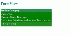
The sample code for the FormView control is as shown below:
<%@ Page Languag”C#” AutoEventWireup=”true” CodeFile=”FormView.aspx.cs” Inherits=”FormView” %>

<!DOCTYPE html PUBLIC “-//W3C//DTD XHTML 1.0 Transitional//EN”
“http://www.w3.org/TR/xhtml1/DTD/xhtml1-transitional.dtd” >

<html xmlns=”http://www.w3.org/1999/xhtml”>
 <head runat=”server” >
    <title>asp.net FormView: how to use</title>
 </head>
 <body>
    <form id=”form1” runat=”server”>
    <div>
       <h2 style=”color:Teal”>FormView</h2>
       <asp:SqlDataSource ID=”SqlDataSource1” runat=”server” ConnectionString=”<%$ConnectionStrings:Northwind %>” SelectCommand = “SELECT CategoryID, CategoryName, Description FROM Categories”>
       </asp:SqlDataSource>
       <asp:FormView ID=”FormView1” runat=”server” DataSourceID=”SqlDataSource1” AllowPaging=”true”>
        <HeaderTemplate>
          Product Catogory
        </HeaderTemplate>
        <ItemTemplate>
          CategoryID:<%#Eval ( “CategoryID”)%><br/>
          CategoryName:<%#Eval ( “CategoryName”)%><br/>
          Description:<%#Eval ( “Description” )%>
        </ItemTemplate>
        <pagerSettings Mode=”Numeric” />
       </asp:FormView>
    </div>
    </form>
 </body>
</html>
The code behind file for the control is as shown below:
public partial class FormView: System.Web.UI.Page
{
   protected void Page_Load( object sender, EventArgs e)
   {
    if(!this.IsPostBack)
    {
      FormView1.HeaderStyle.BackColor=System.Drawing.Color.SeaGreen;
      FormView1.HeaderStyle.ForeColor=System.Drawing.Color.Snow;
      FormView1.HeaderStyle.Font.Bold=true;
      FormView1.PagerStyle.BackColor=System.Drawing.Color.ForestGreen;
      FormView1.PagerStyle.ForeColor=System.Drawing.Color.AliceBlue;
      FormView1.RowStyle.BackColor=System.Drawing.Color.Green;
      FormView1.RowStyle.ForeColor=System.Drawing.Color.White;
    }
   }
}
Output is:
14.5 Data List Control
The DataList control is used to display a repeated list of items that are bound to the control. There are different templates using which user can design the layout of the control. The template property are mentioned below:
Template Property | Description |
ItemTemplate | It contains the HTML elements and controls to render for each row in the data source |
AlternatingItemTemplate | It contains the HTML elements and controls to render once for every other row in the data source |
SelectedItemTemplate | It contains the elements to render when the user selects an item in the DataList control |
EditItemTemplate | It specifies the layout of an item when the edit mode is working |
HeaderTemplate | It contains all the text and controls to be rendered at the beginning of the list |
FooterTemplate | It contains all the text and controls to be rendered at the end of the list |
SeperatorTemplate | It contains all elements to render between each item |
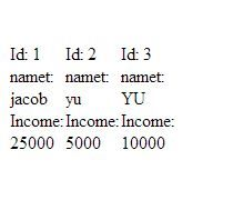
A sample code to demonstrate the DataList control is as shown below:
<%@Page Language=”C#” %>
<! DOCTYPE html>
<script runat=”server”>
</script>
<html xmlns=”http://www.w3.org/1999/xhtml”>
 <head runat=”server”>
   <title></title>
 </head>
 <body>
   <form id=”form1” runat=”server”>
     <div>
     <asp:DataList ID=”DataList1” runat=”server” DataKeyField=”Id” DataSourceID=”SqlDataSource1” Height=”285px” RepeatColumns=”3” RepeatDirection=”Horizontal” Width=”134px”>
    <ItemTemplate>
    Id:
    <asp:Label ID=”IdLabel” runat=”server” Text=’<%# Eval ( “Id” )%>’ />
    <br/>
    name:
    <asp:Label ID=”nameLabel” runat=”server” Text=’<%# Eval ( “name” )%>’ />
    <br/>
    Income:
    <asp:Label ID=”IncomeLabel” runat=”server” Text=’<%# Eval ( “Income” )%>’ />
    <br/>
    <br/>
       </ItemTemplate>
       </asp:DataList>
       <asp:SqlDataSource ID=”SqlDataSource1” runat=”server” ConnectionString=’<%$ConnectionStrings:ConnectionString %>”
       SelectCommand=”SELECT * FROM [footerex]”>
       </asp:SqlDataSource>
     </div>
   </form>
 </body>
</html>
Output is:
14.6 Repeater Control
The Repeater control is a data bound control created by using the templates to display items. The control does not support editing, paging or sorting of data rendered through the control. The list of templates supported by the Repeater control are as mentioned below:
Templates | Description |
HeaderTemplate | It contains all the text and controls to be rendered at the beginning of the list |
FooterTemplate | It contains all the text and controls to be rendered at the end of the list |
AlternatingItemTemplate | It contains the HTML elements and controls to render once for every other row in the data source |
SeperatorTemplate | It contains all elements to render between each item |
ItemTemplate | It contains the HTML elements and controls to render for each row in the data source |
The sample code for the Repeater control is as shown below:
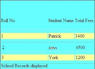
<body>
  <form id=”form1” runat=”server”>
    <div>
      <asp:Repeater ID=”RepeaterInformation” runat=”server”>
    <HeaderTemplate>
        <table class=”tblcolor”>
        <tr>
            <b>
            <td>
            Roll No
            </td>
            <td>
            StudentName
            </td>
            <td>
            Total Fees
            </td>
            </b>
        </HeaderTemplate>
        </ItemTemplate>
        <tr class=”tblrowcolor”>
        <td>
            <%#DataBinder.Eval ( Contiane.”DataItem.RollNo”)%>
        </td>
        <td>
            <%#DataBinder.Eval(Contianer,”DataItem.Name”)%>
        </td>
        <td>
            <%#DataBinder.Eval(Contianer.”DataItem.Fees”)%>
        </td>
        </tr>
        </ItemTemplate>
        <SeperatorTemplate>
        <tr>
        <td>
            <hr/>
        </td>
        <td>
            <hr/>
        </td>
        <td>
            <hr/>
        </td>
        </tr>
        </SeperatorTemplate>
        <FooterTemplate>
        <tr>
        <td>
            School Records displayed
        </td>
        </tr>
        </table>
        </FooterTemplate>
    </asp:Repeater>
     </div>
  </form>
</body>
The code behind file is as shown below:
public partial class _Default: System.Web.UI.Page
{
  SqlConnection con;
  SqlCommand cmd = new SqlCommand();
  protected void Page_Load( object sender, EventArgs e)
  {
    con=new SqlConnection( ConfigurationManager.ConnectionStrings[“constr”].ConnectionString);
    cmd.Connection=con;
    com.Open();
    RepeatInformation.DataSource = cmd.ExecuteReader();
    RepeatInformation.DataBind();
    con.Close();
  }
}
Output is :
14.7 ListView control
The ListView control is used to bind to data items returned to the data source and display them. The control displays data in a format defined by using templates and styles. The list of templates supported by the control are as shown below:
Templates | Description |
ItemTemplate | It identifies the data bound content to display for single items |
ItemSeperatorTemplate | It identifies the content to be rendered between the items |
LayoutTemplate | It identifies the root template that defines the main layout |
GroupTemplate | It identifies the content of the group layout |
GroupSeperatorTemplate | It identifies the content to be rendered between the group of items |
EmptyItemTemplate |
It identifies the control to render for an empty item when the GroupTemplate is used |
EmptyDataTemplate | It identifies the content to render if the data source returns no data |
SelectedItemTemplate | It identifies the content to render for the selected data item to differentiate the selected item from the other displayed items |
EditItemTemplate | It identifies the content to render when the item is lost |
InsertItemTemplate | It identifies the content to render when an item is being inserted |
A sample code for the list control is as shown below:
<html xmlns=”http://www.w3.org/1999/xhtml”>
 <head id”Head1” runat=”server”>
   <title>ListViewControl – how to use ListView control in asp.net </title>
     <style type=”text/css”>
    .TableCSS
    {
      border-style:none;
      background-color:DarkOrange;
       width:600px;
    }
    .TableHeader
    {
       background-color:OrangeRed;
       color:snow;
       font-size:large;
       font-family:Verdana;
    }
    .TableData
    {
       Background-color:Orange;
       color:Snow;
       font-family:Courier New;
       font-size: medium;
       font-weight:bold;
        }
     </style>
 </head>

 <body>
   <form id=”form1” runat=”server”>
     <div>
    <h2 style=”color:Navy; font-style:italic;”>ListView Control Example: How to Use ListView Control</h2>
    <hr width=”550” align=”left” color=”PowderBlue” />
    <asp:SqlDataSource ID=”SqlDataSource1” runat=”server” ConnectionString=”<%$ConnectionStrings:NorthwindConnectionString” %>”
    SelectCommand = “Select ProductID, ProductName From products Order By ProductId”
    >
    </asp:SqlDataSource>
    <br/>
    <asp:ListView ID=”ListView1” runat=”server” DataSourceID=”SqlDataSource1” >
    <LayoutTemplate>
    <table runat=”server” class=”TableCSS”>
       <tr runat=”server” class=”TableHeader”>
        <td runat=”server”>ProductID</td>
        <td runat=”server”>ProductName</td>
       </tr>
       <tr id=”ItemPlaceHolder” runat=”server”>
       <tr runat=”server”>
        <td runat=”server” colspan=”2”>
        <asp:DataPager ID=”DataPager1” runat=”server”>
        <Fields>
         <asp:NextPreviousPageField ButtonType=”Link” />
        </Fields>
        </asp:DataPager>
        </td>
       </tr>
    </table>
    </LayoutTemplate>
      <ItemTemplate>
        <tr class=”TableData” >
        <td>
          <asp:Label ID=”Label1” runat=”server” Text=’<%#Eval(“ProductID”)%>’>
            </asp:Label>
        </td>
        <td>
            <asp:Label ID=”Label2” runat=”server” Text=’<%#Eval (“ProductName”)%>’>
            </asp:Label>
        </td>
        </tr>
       </ItemTemplate>
    </asp:ListView>
     </div>
   </form>
</body>
Output is:
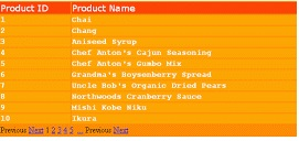
14.8 Data Pager control
Data Pager control is used to create interface for navigation through multiple pages containing multiple records. The DataPager control has some properties associated with it. The list of the properties is as mentioned below:
Property | Description |
PageSize | It is used to get or set the number of data items to display in a page |
PagedControlID | It is used to set the control ID for the page |
StartRowIndex | It is used to get the index of the first item in a page |
MaximumRow | It is used to get the maximum number of rows to retrieve from the database for a page |
TotalRowCount | It is used to get the total number of rows or items in the datasource |
A sample code to demonstrate the Data Pager control is as shown below:
<html xmlns=”http://www.w3.org/1999/xhtml”>
<head id=”head1” runat=”server”>
    <title>DataPager control – how to use DataPager control in asp.net </title>
    <style type=”text/css”>
    .TableCSS
    {
        border-style:none;
        background-color:OrangeRed;
        width:600px;
    }
    .TableHeader
    {
        background-color:DeepPink;
        color:snow;
        font-size:large;
        font-family:Verdana;
        height:45px;
    }
    .TableData
    {
        background-color:HotPink;
        color:snow;
        font-size:medium;
        font-family:Courier New;
        font-weight:bold;
        height:30px;
    }
    .TablePager
    {
        background-color:DarkSeaGreen;
        height:50px;
    }
    .ButtonCSS
    {
        color:Green;
        height:35px;
        font-weight:bold;
    }
    .NumericButtonCSS
    {
        font-size: x-large;
        font-family: Courier New;
        color:Green;
        font-weight:bold;
    }
    .CurrentPageLabelCSS
    {
        color:Green;
        font-size:xx-large;
        font-family:Courier New;
        font-weight:bold;
    }
    .NextPreviousButtonCSS
    {
        color:Green;
        font-size:large;
        font-family:Courier New;
        font-weight:bold;
    }
</style>
</head>
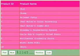
Output is: