
Let us learn how to create a simple image gallery. This gallery is coded in HTML and styled with CSS.
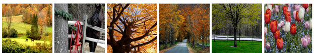
We are using six images to demonstrate the gallery today all of them with 100 x 100 size to avoid frustrating layout.
Div would be used as a container, anchors to insert image links, the user would be redirected to a particular web page if he clicks on an image.
Let’s look at the code:
<html>
   <body>
      <div class=”gallery”>
         <a href="http://www.saphotos.com"><img src="C:/Users/User/Desktop/Horses.jpg" width="100" height="100"></a>
         <a href="http://www.saphotos.com"><img src="C:/Users/User/Desktop/Black Beauty.jpg" width="100" height="100"></a>
         <a href="http://www.saphotos.com"><img src="C:/Users/User/Desktop/Yellow.jpg" width="100" height="100"></a>
         <a href="http://www.saphotos.com"><img src="C:/Users/User/Desktop/way.jpg" width="100" height="100"></a>
         <a href="http://www.saphotos.com"><img src="C:/Users/User/Desktop/Greeny.jpg" width="100" height="100"></a>
         <a href="http://www.saphotos.com"><img src="C:/Users/User/Desktop/Tulips.jpg" width="100" height="100"></a>
      </div>
   </body>
</html>
The output of the above program would be a gallery of clickable images:
If you click on each image you would be re-directed to the original site where these images are actually hosted. If you want to open the image in a separate tab or window you just have to include target=”_blank” like this,
<a href=http://www.saphotos.com target=”_blank”><img src="C:/Users/User/Desktop/Horses.jpg" width="100" height="100"></a>
So far we have achieved the above result using just HTML, now our CSS enters and it just gives a stylish tweak to the code.
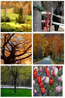
Image Gallery in two columns
<html>
   <head>
      <style>
         .gallery {
         width: 210px;
         }
      </style>
   </head>
   <body>
      <div class="gallery">
         <a href="http://www.saphotos.com"><img src="C:/Users/User/Desktop/Horses.jpg" width="100" height="100"></a>
         <a href="http://www.saphotos.com"><img src="C:/Users/User/Desktop/Black Beauty.jpg" width="100" height="100"></a>
         <a href="http://www.saphotos.com"><img src="C:/Users/User/Desktop/Yellow.jpg" width="100" height="100"></a>
         <a href="http://www.saphotos.com"><img src="C:/Users/User/Desktop/way.jpg" width="100" height="100"></a>
         <a href="http://www.saphotos.com"><img src="C:/Users/User/Desktop/Greeny.jpg" width="100" height="100"></a>
         <a href="http://www.saphotos.com"><img src="C:/Users/User/Desktop/Tulips.jpg" width="100" height="100"></a>
      </div>
   </body>
</html>
The output would be like this:
We can add different styles to the gallery like zoom in the images when hovered, to fade in or fade out images when they are hovered, to make images appear round and creativity unlimited!
<html>
   <head>
      <style>
         .gallery{
         width: 210px;
         }
         img{
         opacity:0.2;
         }
         .gallery img:hover {
         border-radius:50%;
         opacity: 0.8;
         }
      </style>
   </head>
   <body>
      <div class="gallery">
         <a href="http://www.saphotos.com"><img src="C:/Users/User/Desktop/Horses.jpg" width="100" height="100"></a>
         <a href="http://www.saphotos.com"><img src="C:/Users/User/Desktop/Black Beauty.jpg" width="100" height="100"></a>
         <a href="http://www.saphotos.com"><img src="C:/Users/User/Desktop/Yellow.jpg" width="100" height="100"></a>
         <a href="http://www.saphotos.com"><img src="C:/Users/User/Desktop/way.jpg" width="100" height="100"></a>
         <a href="http://www.saphotos.com"><img src="C:/Users/User/Desktop/Greeny.jpg" width="100" height="100"></a>
         <a href="http://www.saphotos.com"><img src="C:/Users/User/Desktop/Tulips.jpg" width="100" height="100"></a>
      </div>
   </body>
</html>
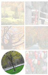
The desired output would be:


Unhovered First image becomes more clear when hovered upon
The images would be shown with fade-out effect since we have set the image opacity to 0.2. You can see the same in the first picture above. In the second picture above, the first image becomes clearer and the borders become round as you hover on it. To achieve the effect associated with hover we have used :hover pseudo class for image.
One more interesting style you could apply to this would be rotating the image when it is hovered on. Like this:
Just add this line transform: rotate(-20deg); in the image: hover pseudo class. The above effect works in only some browsers. The rotation of the image depends on the degree you mention, it can be either positive or negative.
If you use the things you learn with a little experimentation then you can have beautiful web pages!