While developing window store app, User Interface is the part that is most important and directly accessed by users. We can use WinRT library for creating the user interface of window store app.
1. Adding elements to an app
In every app scenario, we need many UI elements like Text Box, Radio Buttons, List Boxes, Password Boxes, Check box, Images and many more according to the requirement of app.
In window store apps controls can be added at either design time or runtime.
While adding controls at design time we can use XAML code. On the other hand while adding controls at run time we need XAML code and C# code.
Design Time:
XAML is declarative mark up language which can be used to create UI for apps. Using XAML we can create visible UI elements, bind data to them, create events and add other features also.
When we drag any control from the control list and drop it on the design surface of app, XAML code is automatically generated. We can change the default properties of XAML control then.
Example:
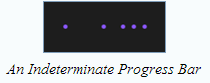
If we want to add a progress bar at design time having IsIndeterminate property true we can use following code:
<ProgressBar IsIndeterminate=”True” Height=”49” Margin=”350,504,354,215”/>
Output will be as:
Runtime:
Consider a scenario where we are creating an app, that can be used to keep track of various activities like meetings, appointments and others, we need to populate the days of month and year in this app, so that user can select any date and time at the execution time of app. In this scenario we should add controls at the execution time in our app, that we can do using C# code and XAML code.
For dynamically adding controls we need Panel Controls like Grid, StackPanel or Canvas in our app.
Example
Consider a scenario where we have to add a Grid control in our app and add a button control at runtime in this Grid for this we can use following code:
<Grid x:Name=”gridmain” Background=”{StaticResource ApplicationPageBackgroundThemeBrush}”>
After this XAML code, we can write following code in cs file as:
Button submitButton=new Button (); // within class definition
submitButton.Content=”Submit”; // within the constructor
gridmain.Children.Add(submitButton);
2. Organize various UI elements
After adding controls in our app, we have to organize them on the User Interface that involves sizing and positioning the elements in our UI. We can do this by putting the controls in various Panel controls.
In Window store apps, there are two types of layouts are available:
Absolute Layout
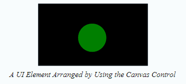
This layout is used when we want to position the UI elements to exact positions in app. For this XAML provides Canvas Control.
Canvas control acts like a container and various UI elements can be added to it. Canvas control does not allow adaptation to different screen sizes. So if we need to use the same app on different devices, we have to design different app pages with different sizes.
Example:
<Canvas>
<Ellipse Canvas.Left=”500” Canvas.Top=”250” Fill=”green” Width=”350” Height=”350”/>
</Canvas>
Output is as:
Dynamic Layout
We can use dynamic layout in our app, to make our app adaptable in appearance for various computing devices. Following Panel controls can be used to create dynamic layout:
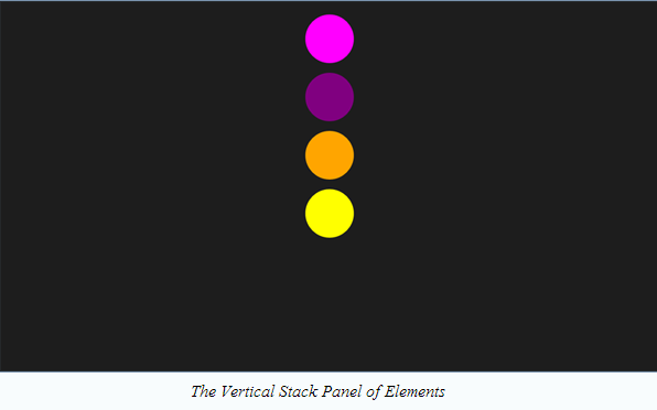
StackPanel
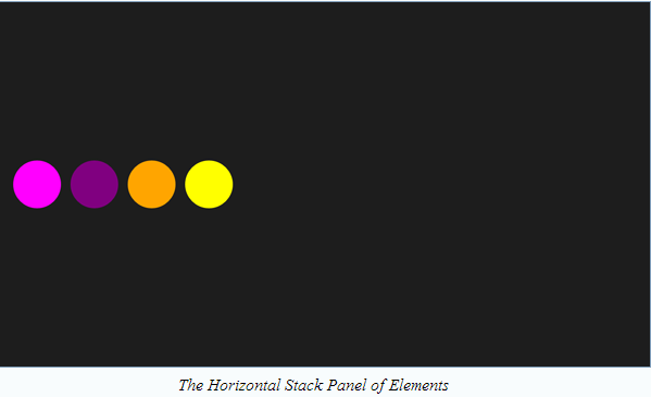
By using this control we can arrange UI elements in a horizontal or vertical line. This control can be used to arrange UI elements in small section or in subsection. By default the alignment of controls in StackPanel is vertically, but it can be changed by using Orientation property.
Example:-
<StackPanel Margin=”20” Orientation=”horizontal”>
<Ellipse Fill=”Magenta” Width=”100” Height=”100” Margin=”10”/>
<Ellipse Fill=”Purple” Width=”100” Height=”100” Margin=”10”/>
<Ellipse Fill=”Orange” Width=”100” Height=”100” Margin=”10”/>
<Ellipse Fill=”Yellow” Width=”100” Height=”100” Margin=”10”/>
</StackPanel>
Output:-
If we change the Orientation property of StackPanel control to Horizontal, the output will be as:
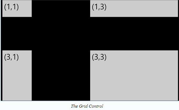
Grid
This control is used to arrange elements in multiple rows and columns. For this firstly we need to specify the rows and columns of the Grid control by using RowDefinitions and ColumnDefinitions property of this control.
Example:
<Grid Margin=”12,0,12,0”>
<Grid.RowDefinitions>
    <RowDefinition Height=”*”/>
<RowDefinition Height=”2*”/>
<RowDefinition Height=”3*”/>
</Grid.RowDefinitions>
<Grid.ColumnDefinitions>
    <ColumnDefinition Width=”*”/>
    <ColumnDefinition Width=”2*”/>
    <ColumnDefinition Width=”3*”/>
</Grid.ColumnDefinitions>
    <TextBox Text=”(1,1)” FontSize=”60” Grid.Column=”0” Grid.Row=”2”/>
    <TextBox Text=”(3,1)” FontSize=”60” Grid.Column=”0” Grid.Row=”2”/>
    <TextBox Text=”(1,3)” FontSize=”60” Grid.Column=”0” Grid.Row=”0”/>
    <TextBox Text=”(3,3)” FontSize=”60” Grid.Column=”0” Grid.Row=”2”/>
</Grid>
Output:-
ViewBox
This control is used to scale its contents to a specified size. It can be used to make interface of our app scale to various devices with different screen resolutions.
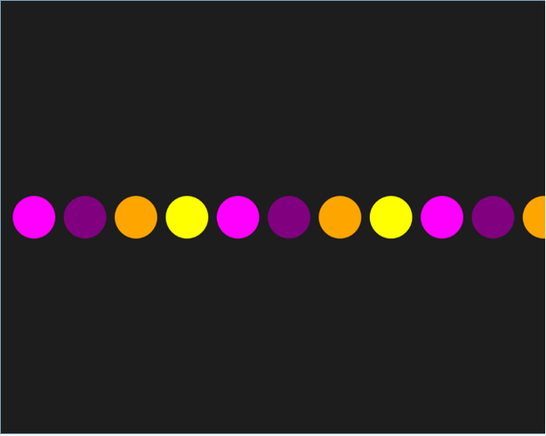
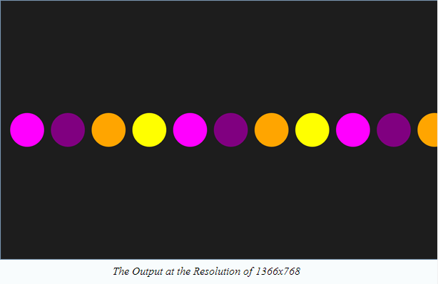
<StackPanel Margin=”20” Orientation=”Horizontal”>
<Ellipse Fill=”Magenta” Width=”100” Height=”100” Margin=”10”/>
<Ellipse Fill=”Purple” Width=”100” Height=”100” Margin=”10”/>
<Ellipse Fill=”Orange” Width=”100” Height=”100” Margin=”10”/>
<Ellipse Fill=”Yellow” Width=”100” Height=”100” Margin=”10”/>
<Ellipse Fill=”Magenta” Width=”100” Height=”100” Margin=”10”/>
<Ellipse Fill=”Purple” Width=”100” Height=”100” Margin=”10”/>
<Ellipse Fill=”Orange” Width=”100” Height=”100” Margin=”10”/>
<Ellipse Fill=”Yellow” Width=”100” Height=”100” Margin=”10”/>
<Ellipse Fill=”Magenta” Width=”100” Height=”100” Margin=”10”/>
<Ellipse Fill=”Purple” Width=”100” Height=”100” Margin=”10”/>
<Ellipse Fill=”Orange” Width=”100” Height=”100” Margin=”10”/>
</StackPanel>
The output of above code in 1366x768 resolutions is as:
Output in 1024 X 768 resolution:
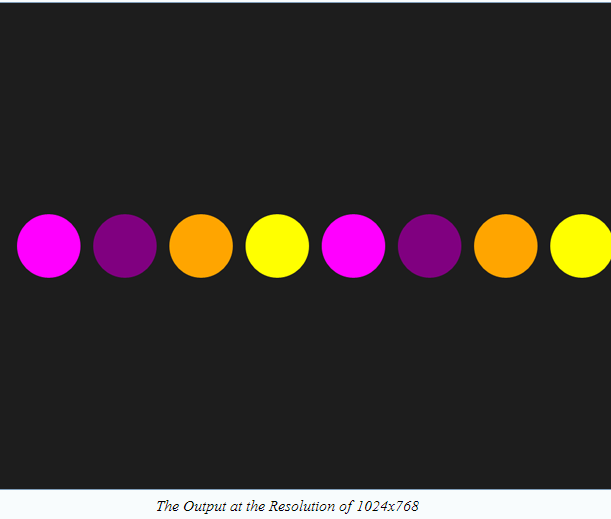
We can see here output is not consistent in different resolutions, to overcome this problem we can modify the previous code as:
<ViewBox>
<StackPanel Margin=”20” Orientation=”Horizontal”>
<Ellipse Fill=”Magenta” Width=”100” Height=”100” Margin=”10”/>
<Ellipse Fill=”Purple” Width=”100” Height=”100” Margin=”10”/>
<Ellipse Fill=”Orange” Width=”100” Height=”100” Margin=”10”/>
<Ellipse Fill=”Yellow” Width=”100” Height=”100” Margin=”10”/>
<Ellipse Fill=”Magenta” Width=”100” Height=”100” Margin=”10”/>
<Ellipse Fill=”Purple” Width=”100” Height=”100” Margin=”10”/>
<Ellipse Fill=”Orange” Width=”100” Height=”100” Margin=”10”/>
<Ellipse Fill=”Yellow” Width=”100” Height=”100” Margin=”10”/>
<Ellipse Fill=”Magenta” Width=”100” Height=”100” Margin=”10”/>
<Ellipse Fill=”Purple” Width=”100” Height=”100” Margin=”10”/>
<Ellipse Fill=”Orange” Width=”100” Height=”100” Margin=”10”/>
</StackPanel>
</ViewBox>
Now the output will be consistent in different resolutions as: